Thursday, 14 April 2016

Girls toys- Work record

Basic information:
Date: 12/04/16
Camera used: Nikon D5300
Props or subject: Props
Editing program: Photoshop CC 2014
Camera settings: 1/125, F9, ISO 200

Plans for shoot:
In this shoot I will be photographing stereotypically female items which are coloured blue to demonstrate a rejection of gender roles.

What I hope to achieve:
In this shoot I hope to revisit the concept from "Pink and blue" shoot however today I will be focusing on the female aspect of this shoot by using traditionally female items in shades of blue.

I will be working with the white background due to the fact that this shoot is linked to the previous shoot boys toys and so follows a similar concept however uses pink male objects opposed to blue female objects to convey the same meaning towards masculinity that this shoot will convey towards femininity.  Due to the parallels between the shoots I have had to move away from the blue background although I personally appreciated the effect which could by gained from the soft blue.

I will be working with dynamic composition as this is something which I aimed to achieve in my work diary based on "Pink and Blue".  I will also be implementing a deep depth of field in order to keep the entire image in focus.

I have also drawn inspiration from Phebe Schmidt whom often uses a combination of colour and composition in order to create an eye catching series as well as to convey implicit meaning to the viewers.

Outcome of shoot:
This shoot was successful due to the fact that the contrast between the white backdrop and various shades of blue created an interesting composition when combined with the variety of items used and the positioning of the objects which created a series of eye catching images.

In this shoot I again altered hue and saturation to create strong colouration in the images to create a strong element of contrast between the objects and background I altered the images contrast, brightness and light levels.

Progression:
If I were to repeat this shoot I would consider finding more blatantly female objects for example blue dolls or a blue teddy bear as this would make the concept that I was attempting to convey more obvious to the viewer.

Favourite image:


 This is my favourite image as I believe that the iconography of nail varnish is associated massively with women and is seen as a very feminine object as a result of this I feel that the use of masculine blue contrasts effectively with the femininity of the image.

I feel that the various shades of blue in the above image also help to create an eye-catching composition as does the layout of the objects in the scene.

Denotation: This is an image of a collection of nail care objects.
Connotation: The objects above would be viewed by many as feminine due to the medias representation of manicures and beauty care to be a predominantly female pass time therefore the contrast of the masculine blue helps to question whether this hobby is solely for women and therefore contrasts with cultural gender norms.
Context: In current culture we are seeing men become far more comfortable in their femininity and many are adopting the use of nail varnish this image attempts to open up discussion on this abandonment of the gender norms in the hope of creating more change against other traditionally gendered activities.

Least favourite image:


This image should be one of my favourites due to the fact that as it contains sanitary towels it is perhaps the most blatant symbol of femininity present on this blog.

The composition and colouration of this image however mean that it is my least favourite from this shoot as the white pads blend in to the background and in editing the white background has turned a sickly green or grey tone.

Denotation: This is an image of blue sanitary towels.
Connotation: This image demonstrates the fact that generalised ideas of femininity can be more masculine whilst masculine ideas can be more feminine as the masculine blue contrasts with the femininity of the pads and cream.
Context: The context for this image is the fact that sanitary towels are not used by all women and are often used by men this is particularly important due to the fact that societies gender norms may harm people whom do not conform to the gender binary through body dysphoria or bullying and a gender norm is not always something as easily altered as whom plays video games or cooks.

Girls toys- Straight images


Girls toys- Contact sheet


Wednesday, 13 April 2016

Girls toys (shoot 10)- Concept

Basic plan

Concept
The concept behind this shoot is to show the comparison between objects generally associated with femininity with the colour blue which is commonly associated with masculinity.  The aim of this shoot is to demonstrate the fact that objects do not have to specifically fit into the gender binary.

Location, equipment etc.
-Studio
-White backdrop
-Table
-Tripod
-Nikon D5300

Boys toys- Work record

Basic information:
Date: 12/04/16
Camera used: Nikon D5300
Props or subject: Props
Editing program: Photoshop CC 2014
Camera settings: 1/125, F9, ISO 200

Plans for shoot:
I need this shoot I will be photographing stereotypically male objects that will be coloured pink in order to represent the the fact that people do not have to restrict themselves to societies views on gender.

What I hope to achieve:
This shoot will revisit the concept of "Pink and Blue however I will be altering the colouration of the objects opposed to the background in this shoot due to the fact that I had issues with the saturation and brightness of the images.  I will also attempt to create more dynamic and engaging compositions.

I will be using a deep depth of field once again in order to allow for the entirety of the subject to be in focus opposed to select objects in the foreground or background of the image.


This shoot is again inspired by Phebe Schmidt due to her use of colourisation to create a dramatic and surreal image however I will be deviating from her style due to the fact that I am no-longer employing the use of brightly coloured backdrops.


Outcome of shoot:
I was happy with the outcome of this shoot due to the fact that I feel that the chosen objects used in this shoot had strong links with societies generalised concepts of masculinity.

I believe that the composition of the images made the series eye-catching to the viewer.  I also feel that the combination of shades of pink helped to make the images stand out from each other as well as to help them not appear flat.  

When editing each of the images I increased the images saturation as well as altered the images hue in order to create a rich tone to draw the viewers eye in however I was careful to not oversaturate the images as this would have reduced the quality of the images.  I also increased the images brightness and contrast whilst slightly reducing the images lightness in order to make the objects in the images stand out from each other.  I have also used the spot healer tool in order to remove dirt marks from previous shoot on the white backdrop.

I had no real issue with this shoot as I feel that any issues which I had discovered in "Pink and Blue" were amended here.

Progression:
The only thing I would alter if I were to repeat the shoot would be to attempt to add some different objects to the series which I could not easily access such as a pink foot ball or sports equipment and pink tools.

Favourite image:


This is my favourite image as I feel that the composition of the toys would draw people into the image I also like the variety of the hues of pink that I have used as I think that it prevents the image from appearing overly flat.

The toy soldiers which I have used directly contrast masculinity and feminism as toy soldiers are a traditionally masculine toy and pink is a traditionally feminine colour I feel that the traditionally masculine iconography employed effectively conveys my concept to the viewer.

Denotation: A collection of pink boys toys.
Connotation: This image strongly demonstrates the fact that boys should be allowed to have access to traditionally feminine things as it contrasts with the ideology that blue is for boys and pink is for girls an idea which is made stronger by the fact that this concept is introduced to people as children and these toys would have been played with by young children.
Context: The social context for this image is the current rejection of gender roles and acknowledgement of the fact that people and things do not have to fit the gender binary currently by societies youth.

Least favourite image:


This is  my least favourite image due to the fact that I feel that the image is largely empty due to the small number of objects present in the shot.

I feel that the use of hygiene products may not make the viewer think automatically of masculinity and that they may instead think of femininity which defeats the objective of this series which is to counteract gender roles.

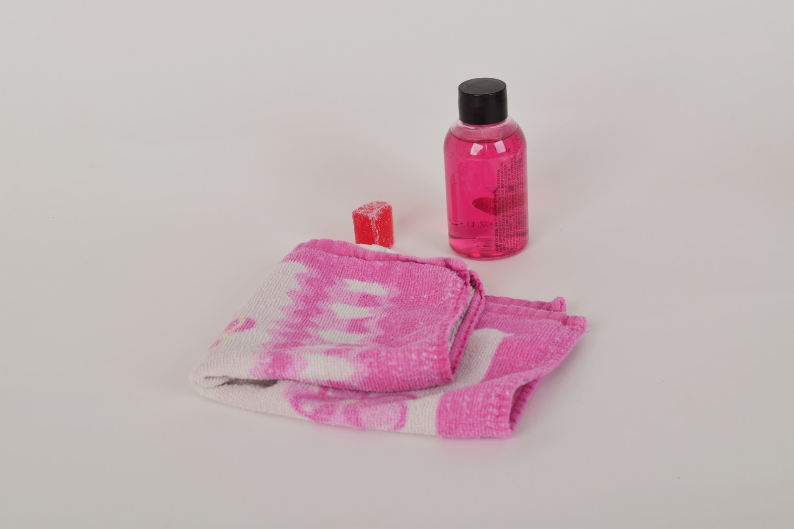
Denotation: A collection of basic hygiene products which are coloured pink.
Connotation: This image should convey the rejection of gender roles through the colour of masculine objects in pink however I feel that use of hygiene products may make the viewer associate it with femininity which would go against my original concept.
Context: The context for this image is modern societies attempt to reject gender roles.

Boys toys- Straight images


Boys toys- Contact sheet